
The inking on this drawing is finally finished (I think.)
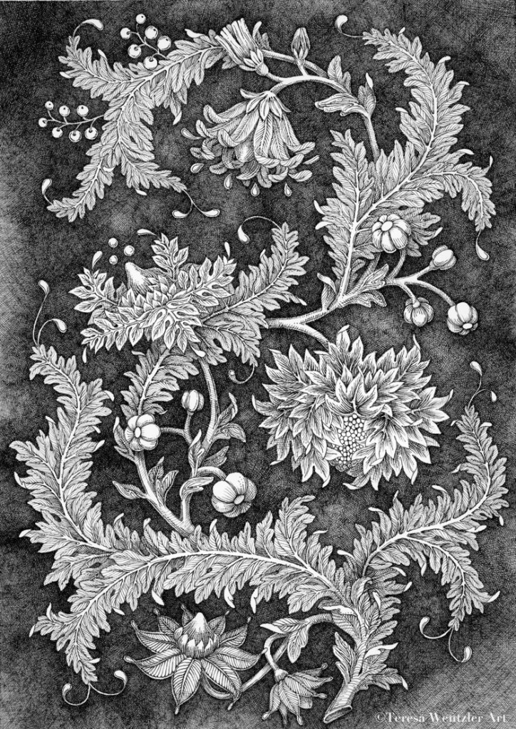
It definitely needs some bright color that won’t be overwhelmed by all of that black. The color will wind up creating the focal point(s)… since everything is fairly equally weighted ink-wise. Warm colors like golds, oranges and reds tend to grab attention (focus), whereas cool colors like greens, blues and purples recede into the background.
After color is added, I’ll determine if there is enough contrast in the inking itself.
Hopefully, the paper won’t be degraded too much by adding the color (either watercolors or Daler-Rowney acrylic ink), and any touch-up I might want to do will be possible.
The size is 8″ X 11″… maybe some of the reason it took so long to ink?!
So, I’m curious: anybody out there use Photoshop (or a similar program) to “try out” various colors before committing to actual tinting an original drawing? In my head, I can imagine certain colors for this piece… but nothing in particular has really made a strong impression so far. (I guess I’m still in black and white mode!)
We’ll see!


 Teresa Wentzler Art
Leave a comment