
So. I’ve been slowly working on adding color to the over-done ink drawing I wrote about here.
I’ve had a set of Derwent Inktense pencils for awhile now, and have never really put them to use. I did however, make a swatch card to see what the colors looked like with water added.
The colors are wonderfully transparent and yes, intense. They are ink pencils and unlike watercolor pencils, the pigments are permanent when dry… which makes them nice for transparent washes: my preferred method when using water media. Watercolor pencil pigment is not 100% permanent, and the wash layers can “mix” especially if they are overworked, making the colors appear a bit muddy.
The very fine lines in the ink drawing are not overly obscured by the Inktense colors… even when the color gets dark… as with the background.
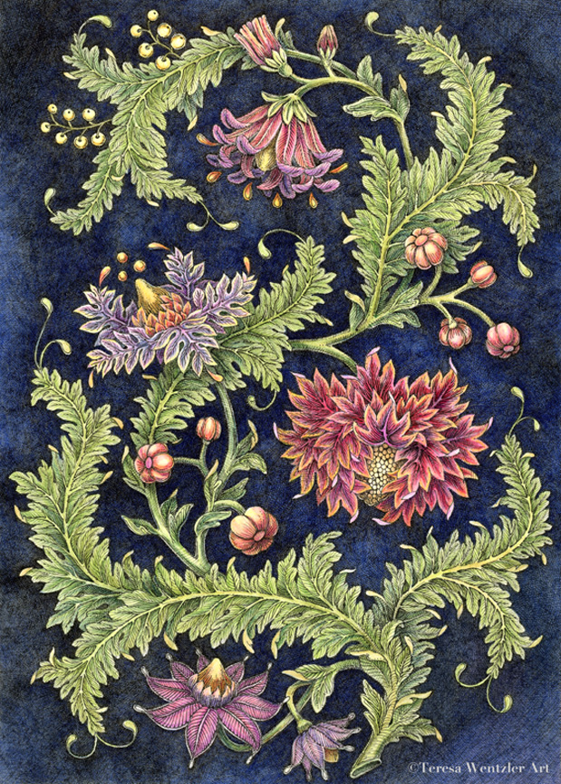
And when the colors are layered and very strong, they don’t obscure the ink lines…as in the largest flower.
I’m OK with my color choices overall. One thing I noticed right away was when I chose to tint the background blue, it limited the choices for the flowers. I found that I really needed to choose colors from the warm end of the spectrum to contrast strongly with the intense (and high chroma) blue background. Also, the greenery needed to stay yellow-ish (warm) overall, with cooler greens for shadowed areas.
As I look at the image on a computer screen, I can see what areas need some further refining… some more shading on the leaves for example. On a dark tinted background, the elements in the drawing (and their colors) require exaggeration to keep them from looking flat/washed out… (which is a lesson I learned when designing needlework specifically for dark fabrics. Ah, memories!)
Anyway! All-in-all, it’s been a true learning experience. AND an enjoyable one. I think there will be more color for me in the future.


Leave a Reply