
Finally! If it’s not totally finished, it’s very close. I need a break from looking at it for a few days.
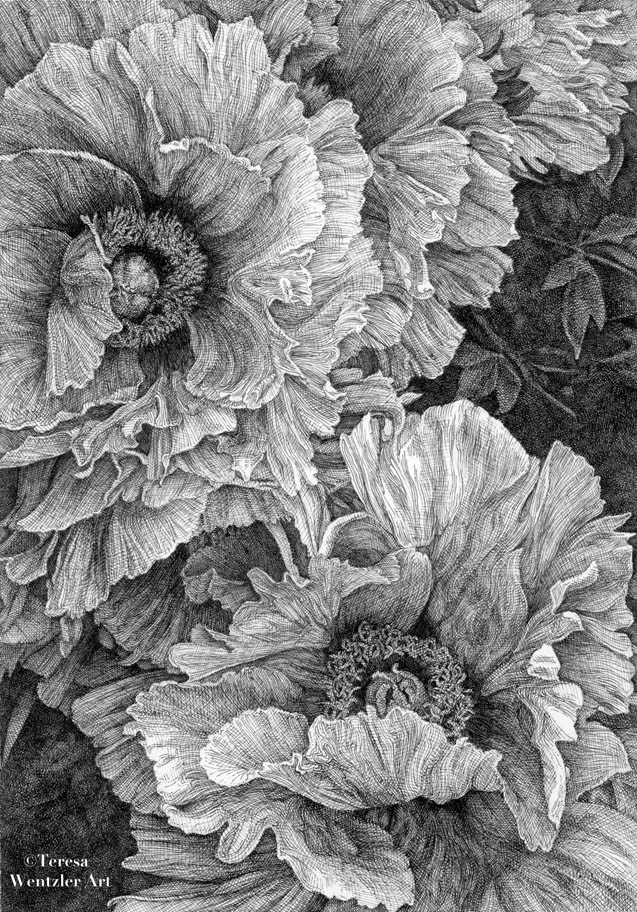
But first, as I promised, a critique of sorts:
The elements of design (art principles): unity, balance, movement, rhythm, focus, contrast, pattern and proportion seem to be in evidence. Some are more obvious than others.
Right off the bat, contrast pops out at me because of the range of values from almost black areas of heavy ink to white of the paper. Pen and ink drawings really need that convincing dark to light or they look flat/lifeless and uninteresting to look at.
One of the things that is very strongly represented is pattern with the repetition/rhythm and movement of all of those petals!
Another thing that’s important is how the viewer’s eye moves around within the drawing to the focal point(s). The directional ink lines within the petals as well as the botanical/physical arrangement of the petals of each flower work together.
After ‘entering’ the drawing from the upper right hand corner, follow the directional line of all of the overlapping petals. The eye naturally lands on the upper full flower.
There are a few REALLY important petals that come into play to direct the viewer’s eye. The most obvious one is the ‘sideways’ petal in the upper full flower at the left side of the drawing (half hiding the flower’s center). It effectively deflects the eye from the edge back into the central area of the drawing.
Next, the eye slides down the ‘waterfall’ of all of those complex (but lighter in value) down-directing petals. Next, the eye hits the lower flower’s center. The cupped petal partially obscuring it keeps the eye from ‘falling off’ the drawing at the bottom. The petals on the right then direct the eye back up into the central area of the drawing.
In this drawing I would say there is more of a focal ‘area’ than a focal point. Since both flowers have relatively equal weight, to make one more prominent somehow didn’t occur to me. And that probably weakened the drawing: an example of being blinded by working from a photograph!
Anyway! Lesson learned. Next time, I’ll more carefully work out the composition even if a really beautiful photograph tempts me to ignore one of the basic elements of good design!
Does anyone else out there regularly work from photographs, or do you prefer to draw from life?


Leave a Reply