
More on the peony drawing. Remember when I said this one would be a slow go? I wasn’t kidding!
This is the drawing so far:
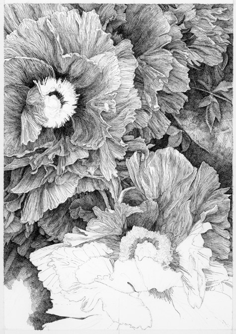
I promised some close ups and some technique explanation in my previous post.
Just a brief intro: My overall style for this drawing is primarily contour and simple line with a healthy dose of cross-hatching.
In this drawing, my strategy with the contour lines is to capture the ambiguous shapes I see within the petals. Are those shapes actually physically (botanically) present in peonies? I doubt it. (Remember I said I’m making things up.) The lines are meant to indicate the growth direction of the petals with their wrinkles, folds, and twists. I’m also trying to capture a limited amount of the darkest (shadowed) areas.
The seemingly ‘wandering’ contour lines are a foundation. Here’s an obvious example of the technique. Centrally located in the image below is a very convoluted petal rendered with just the contour lines. There’s also an area to the right with again, mostly contour lines:
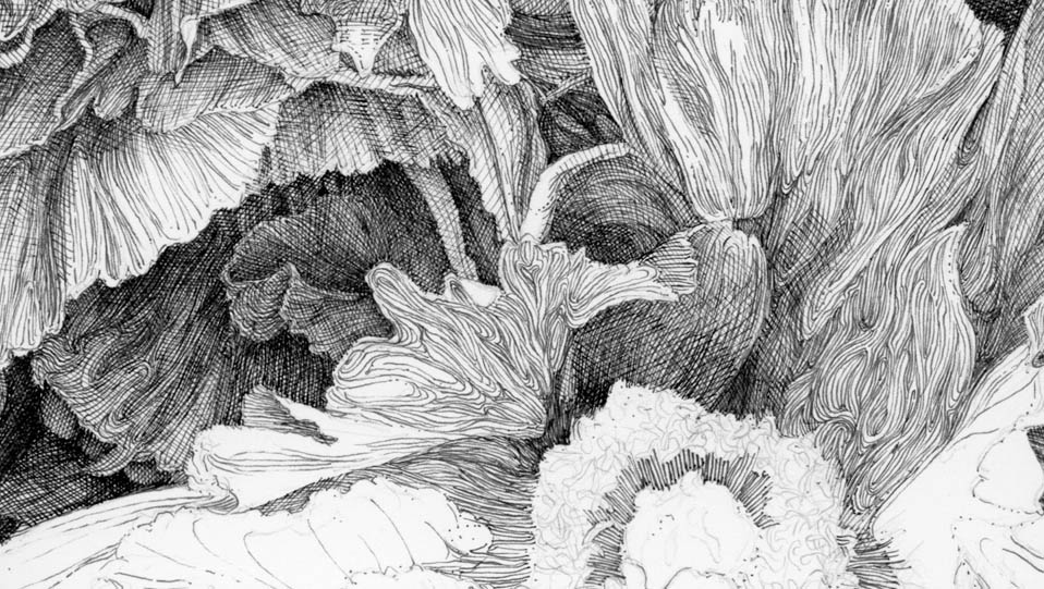
The contour lines by themselves are interesting and swirly and all that, but the overall effect is rather flat. Those areas don’t have much dimension (depth) at present. In order to get additional depth, I add delicate cross-hatch lines on top of the foundational contour lines. The big danger is going too dark too fast with the hatching…
Did I? Maybe. But, before I panic, I have to remember that there is a LOT of white paper showing right next to this area. This by contrast, makes the inked area very dark. It’s going to be close though. I will really need to pay close attention to the contrast in this area. The center of the flower is extremely dark, so I think the petal I just hatched will appear lighter by contrast. At least I hope so.
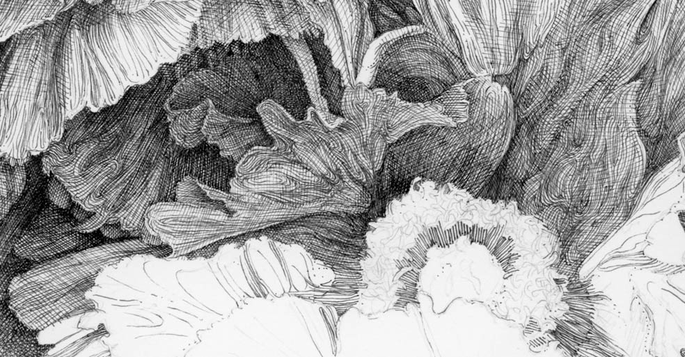
You can see the hatching over the contour foundation in the dark area to the left where the contour lines are almost hidden by the cross-hatching lines, except at the edge of the petal.
It occurs to me I need to backtrack a little and define: Cross-hatching lines are equally spaced lines of equal weight/thickness (technical pens make this easier than dip pens). Once the first layer of cross-hatch lines is finished, another ‘layer’ of the same type of lines is drawn on top of the first layer, often at 90 degrees. Then the next layer would be 45 degrees from the first layer, and so on. I rarely follow that rigid formula unless there is a big, flat surface or area I’m trying to render. I don’t use that formula here as the surfaces I’m rendering are anything but flat. So I take liberties with the technique when shading things like flower petals.
I’m using simple line technique in lighter areas where contour lines would be too heavy and distracting. In places, I sometimes add cross-hatch lines for shading in these more delicate areas:
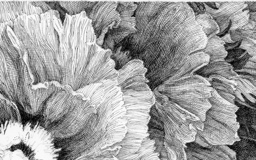
I hope that makes my technique a bit more understand-able.
Onward!
Materials: Copic Multiliner pens in various sizes on smooth bristol paper. Size: @6.5″ X 9″


 Teresa Wentzler Art
Leave a comment