
This is one of those ideas that made it to needlework publication:
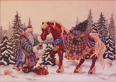
The idea is simple, but it is very enduring in the heart-warming department. It centers on the close friendship bond between a domesticated animal and a human. There are several nods to Christmas. They include the heavily gift-laden draft horse, the bearded and cloaked father Christmas-type figure, and, of course, the winter scenery.
I like the design, especially the colorful-ness of it….but I’ve always wanted to re-work it from a compositional standpoint. Maybe a vertical instead of horizontal format with a more interesting viewpoint of the interaction between the characters?
Overall, I call this design a ‘flat-on’ depiction: everything is arranged into definite layers. There’s the snowy foreground first. Then horse and figure occupy the next layer. After that, there are the trees in a third layer, and finally the mountains in the distance. Everything stays in its layer; there’s no overlap. It’s all very orderly. And, to be honest, pretty boring.
One more thing I’ll mention: there’s no place to “enter” the composition. Bear with me; I’ll try to explain. There’s really no place that invites the viewer into the design. With everything arranged in flat, stacked layers, the viewer doesn’t get any cues as to where to look first. There are no directional devices that show the center of interest. They also do not show how the viewer’s eye gets there. The viewer’s attention is drawn directly to the interaction between the man and horse. This happens because there’s really nowhere else to look.
Anyway. This is my try at a vertical composition:
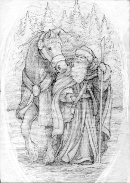
I have always thought this piece needed a decorative border in the needlework version. I may just add one this time around. This format reminds me of old-fashioned Christmas cards, especially if I add an oval-shaped border. I’m seeing this image as offering lots of opportunity for fabric surface embellishment (courtesy of the needlework designer in me).
In this sketch, the figures are shown in depth. The man is in front, walking ahead. The horse follows, his body mostly hidden even ‘deeper’ into the picture plane. The focal point of the drawing is located in roughly the top third of the drawing. The directional devices include strong vertical lines in the fabric folds. They lead the eye toward that point of interaction. The arch in the horse’s neck and the position of its head focus things even further. Still working on it.
Or…
Another idea involves adding children to the scene (awwww factor): contrasting their size with that of the draft horse. With the extra figures, I can’t really see this drawing working vertically. So, this (very rough) sketch defaults back to a horizontal layout with an arching border in a Victorian style. If I scale down the piled-up pack on the horse’s back, I can move the figures up in the frame and allow some room in the foreground for the viewer to visually ‘enter’ the drawing:
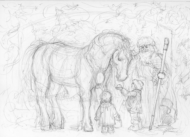
I will be honest, though. This one is not my favorite; it reminds me too much of the needlework version. I’m leaning heavily toward the sketch above.
I guess I have in mind a 5″ X 7″ proportional format because an illustration would translate to greeting cards? Just a thought.
It’s an idea in progress. But that’s part of the fun!


Leave a Reply